2018-2019
Inzazu - ATS Redesign
Dashboard Redesign for Hiring Software.
What is Inzazu and ATS
Inzazu, a company based in Draper, Utah specializes in providing employee verification and certification services to a wide range of institutions and government agencies.
The Applicant Tracking System or ATS is a common acronymn and verbiage among the human resource industry and hiring professionals referring to software or systems in which to manage the hiring processes.
Inzazu aims to maximize value for HR departments and customers by providing ATS software with verification and certification services to enhance candidate quality.
Current State of the ATS
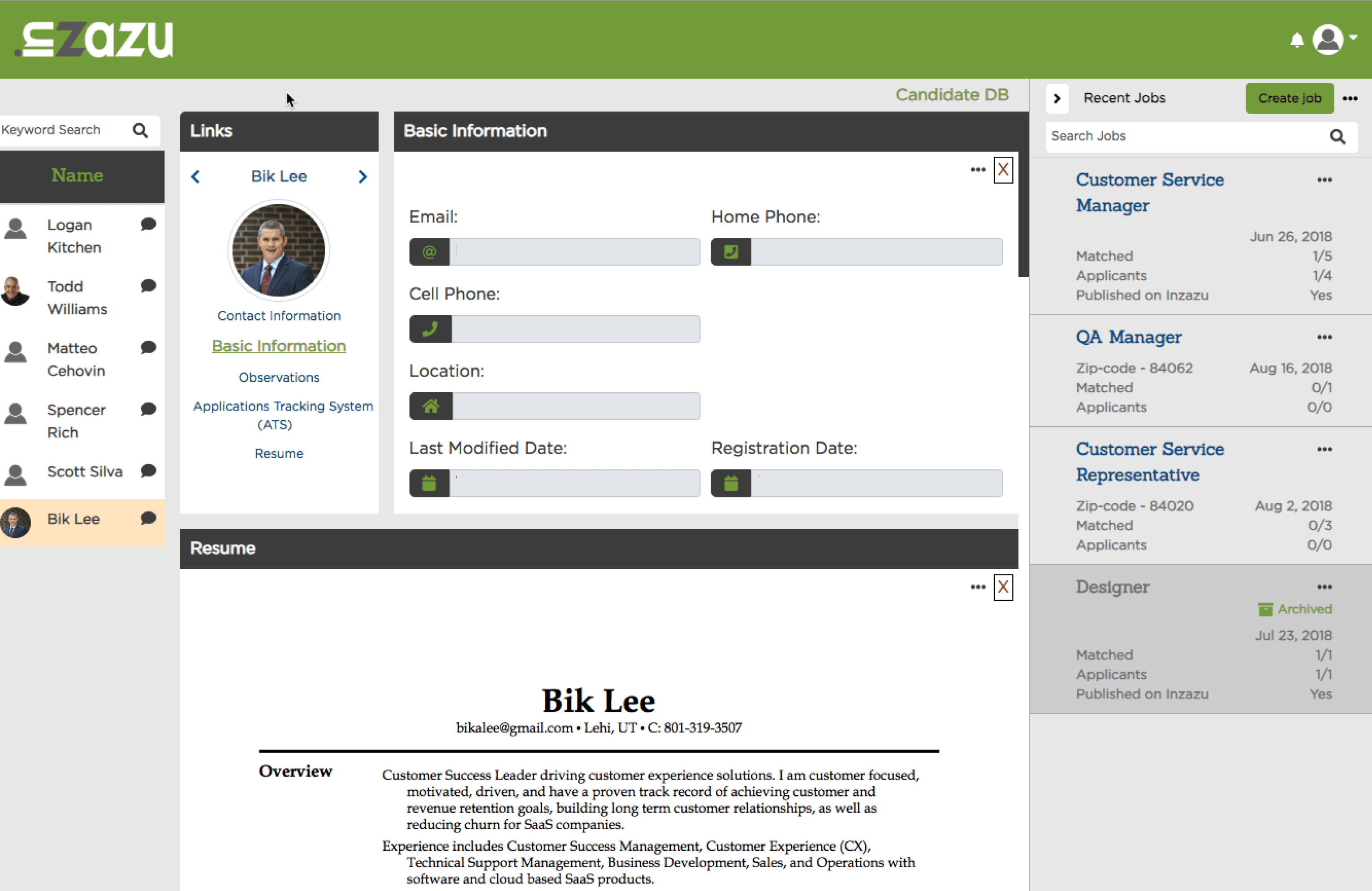
The ATS has been shelved for many years and now has been given new life with renewed opportunity and investment. Inzazu is looking to restore a great idea but knows that it needs a modern visual update.
At fist glance the product is counter-intuitive and visually distracting. But underneath the dated interface is a very valuable tool in need of a simple redesign. My 6 steps to improve this experience are detailed below.

Step 1
Begin with a Wireframe
We can disregard styling for now and use a basic wireframe to focus on the main components and features of the dashboard.

Step 2
Identify Componenets
The ATS is divided into three sections as shown. Number 1 is the Job Listings, number 2 is the Applicants who have applied for the job and number 3 is the Applicants Information, status, hiring process, etc.

Step 3
Identify Hierarchy
The first interaction for any user is the Job Listing located in a scroll view on the far right of the screen.

When a Job Listing is selected the list of Applicants are populated on the far left pertaining to that Job Listing.

Subsequently when an Applicant is selected, the main viewport aka Applicant Info is populated with information such as the hiring processes, credentials, qualifications, interviews and verified status. This information is displayed in lengthy scrollable window.

Now that we understand how the application is intended to be used lets make a couple tweaks to improve the users cognitive load and simplify the experience.
Step 4
Improve Hierarchy
My first suggestion would be to move the Job Listing to the right side of the dashboard to reorder the hierarchy.

This improves the natural flow and creates an intuitive user experience that reads like a book from left to right.

Step 5
Improve Redundancy
The Applicant Info is where all inputs, actions and processes take place, critical to customer value. With in the hiring stage there are five or six sections regarding the applicants hiring process. Having all sections present in a single window creates redundant scrolling and limits access to desired features.

Utilizing tabs provides the user with direct selection and eliminates scrolling, resulting in quicker actions of intent and comprehension.

Reducing the mental effort required to interact with the interface allows the user to focus on their tasks rather than content structure or learning curve.

Step 6
Styling Improvements and Mockup.
A visually appealing interface can create a positive first impression and make the software more engaging. By staying current with modern UI design, you can create software that is not only functional but also visually appealing, user-friendly, and competitive. Suggested style changes:
- Typography standardization, a singular font with multiple weights.
- Color Palette standards with light monochrome theme.
- Consistent spacing and responsiveness.
- Implement standards for a style guide and eventual design system.


Conclusion
I believe these changes will enhance usability, reduce the learning curve, and foster a positive user experience. This leads to increased user satisfaction, engagement, and loyalty. It also it translates into higher user adoption rates, reduced customer support costs, and improved brand reputation.
By prioritizing a simple and intuitive design, Inzazu can align their software with user expectations, making it more accessible and appealing to a wider audience and a competitive advantage.
Inzazu stakeholders were pleased with the results and are planning to implement these changes in near future.